Vaccination status in mortality rates: Are there any patterns in the data?

Niva Maja on 23.11.2023
I wanted to compare the vaccination rate in the population to the vaccination rate in mortality rates based on age.
The vaccination rate in the population and the vaccination rate in mortality rates should match, on average, if there is no underlying cause that leads to one of the groups (either the Vaccinated group or the Unvaccinated group) to be overrepresented in mortality rates.
Expectations
The vaccination rate is probably higher in the more vulnerable group (people that already had health problems) compared to the general population, and the more vulnerable group is probably more represented/present in the mortality rates. For this reason, it could have been expected that the vaccination rate in mortality rates would be higher than the vaccination rate in the population. Therefore, finding that the vaccination rate in mortality rates is at the population vaccination rate or above the population vaccination rate would not be unexpected. And it could not be interperted unambigously as related to the introduction of mRNA vaccines, as many interpretations of this finding are plausible.
Using secondary data analysis: Assuring data quality
When using secondary data analysis assuring the quality of the data is the most important thing. If the data are not reliable and valid then how could any inferences made based on this data be valid? For this reason, I always rely on the reliability, credibility, and trustworthiness of the source of data, and use only secondary data where the source of data can be viewed as a guarantee for data quality.
For my analysis, I choose Office of National Statistics (ONS) datasets, even though many datasets are available. In my opinion official records (such as those provided by the ONS) are the most reliable and trustworthy data available.
Datasets used in the analysis
The ONS datasets I used in my analysis were:
- Coronavirus and vaccination rates in people aged 18 years and over by socio-demographic characteristic, region and local authority, England (31 January 2023 edition of this dataset). This dataset provides the vaccination rates for each age group: the percentage of people in each of the age groups that was vaccinated.
- Deaths by vaccination status, England (Deaths occurring between 1 April 2021 and 31 May 2023 edition of this dataset). This dataset provides vaccination status of the people who died between 1 April 2021 and 31 May 2023, for each of the age groups.
- Monthly mortality analysis, England and Wales (July 2023 edition of this dataset). This dataset provides monthly mortality rates. This dataset was used for comparison of mortality rates provided in the Deaths by vaccination status, England dataset.
Analysis
Group comparisons were made based on the age groups available in the datasets. In Coronavirus and vaccination rates in people aged 18 years and over by socio-demographic characteristic, region and local authority, England dataset age was coded in terms of the following categories: "18-29", "30-39", "40-49", "50-59", "60-69", "70-79", "80+".
In Deaths by vaccination status, England dataset age was coded in similar categories: "18-39", "40-49", "50-59", "60-69", "70-79", "80-89", "90+".
Therefore, the age groups used to compare vaccination rate in the population and the vaccination rate in mortality rates were "18-39", "40-49", "50-59", "60-69", "70-79", "80+".
When comparing Table 2 to Table 5 from Deaths by vaccination status, England dataset, the age groups present in the dataset were used: "18-39", "40-49", "50-59", "60-69", "70-79", "80-89", "90+".
Vaccination rate was computed from Table 3 in Coronavirus and vaccination rates in people aged 18 years and over by socio-demographic characteristic, region and local authority, England dataset. Vaccination rate was computed as: (1 − "Percentage of people who had not received a vaccination (%)"). Other tables in Coronavirus and vaccination rates in people aged 18 years and over by socio-demographic characteristic, region and local authority, England dataset provide information about receiving multiple vaccines, and Table 3 was selected to enable comparisons between vaccination rate in the population and the vaccination rate in mortality rates, as Table 5 in Deaths by vaccination status, England dataset provided only two categories: "Unvaccinated" and "Ever vaccinated".
I replaced "<3" entries in Tabe 2 in Deaths by vaccination status, England dataset with a more conservative estimate of 1, and used this for my data analysis.
Table 2 and Table 5 in Deaths by vaccination status, England dataset provided mortality rates based on vaccination status for each of the age groups. Table 2 included fewer cases than Table 5. Therefore, I decided to keep both Table 2 and Table 5 for the analysis and compare the results across Table 2 and Table 5. Table 2 vaccination status was recoded to match Table 5 vaccination status groups: "Unvaccinated" and "Ever vaccinated".
Findings: Differences in numbers
The most interesting finding I came across was that there were differences in mortality rates provided in the dataset Deaths by vaccination status, England. The dataset included Table 1, Table 2, Table 3, Table 4, and Table 5. Tables 1 to 4 provide exactly the same mortality rates for each month (when summing them for each month across different categories) , and only Table 5 provides a completely different set of mortality rates (the sum across different categories differs meaningfully form those provided in other tables).
I decided to use Table 2 and Table 5 for my analysis, because they should provide the same information. Table 5 provides mortality rates by age group, month and vaccination status. In Table 5 vaccination status is broken down into " Unvaccinated " and "Ever vaccinated ". Table 2 provides mortality rates broken down by the same age groups, same months. The only difference is that in Table 2 vaccination status is broken down into further categories.
The differences between Table 2 and Table 5 could be observed in the screenshots of Table 2 and Table 5 below.
Table 2
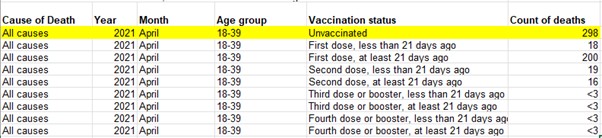
In Table 2 the number of all cause deaths in April 2021 in the age group '18-39' was recorded as 298 for the unvaccinated group.
Table 5
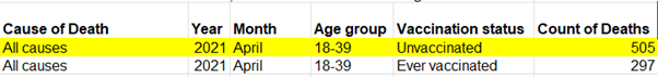
In Table 5 the number of all cause deaths in April 2021 in the age group '18-39' was recorded as 505 for the unvaccinated group.
The discrepancy between mortality rates for the "18-39" age group in Table 2 and Table 5 for the "Unvaccinated" group is 207 (505-298=207) for April 2021. When the number 298 (Table 2) is increased to 505 (Table 5), this represents a 70 % increase. Therefore, the mortality rate of "Unvaccinated" group varies by 70 % from one table to the other (just for April 2021).
The difference between mortality rates in Table 2 and Table 5 for the "Ever vaccinated" group mortality rate is 40 for the "18-39" age group in April 2021. When the number 247 (Table 2) is increased to 297 (Table 5), this represents a 16 % increase. Therefore, the mortality rate of "Ever vaccinated" group varies by 16 % (for April 2021).
Comparing the percent change form Table 2 to Table 5 across the two groups, there is almost 4.5-times more variability in the "Unvaccinated" group as there is in the "Ever Vaccinated" group (70 / 15.5 = 4.46). Perhaps this high discrepancy is due to chance alone and there are other months where the ratio is reversed (the percentage increase is much higher for the "Ever Vaccinated" group compared to the "Unvaccinated" group).
Therefore, examining the differences in Table 2 and Table 5 for other dates should show if larger increases for the "Unvaccinated" group (compared to the "Ever vaccinated" group) is a consistent trend or a random occurrence.
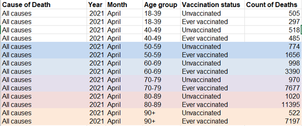
So, I computed the percentage of increase in mortality rates provided in Table 5 from the mortality rates provided in Table 2: for how much the numbers increased going form Table 2 to Table 5 for each of the groups ("Ever Vaccinated" and "Unvaccinated"), calculated as percentages of increase in mortality rates in Table 2. Because the vaccination rate in the population is high, this results in disproportionate effects when comparing raw numbers for the "Ever Vaccinated" and "Unvaccinated" groups. For example, as could be seen from the screenshot of Table 5 below, for "80-89" the mortality rate in the "Unvaccinated" group is 1.020, and the mortality rate for "80-89" in the "Ever Vaccinated" group is 11-times higher: 11.395. Therefore, in my opinion, comparing percentage increases seems more reasonable: as an increase of 1.000 would represent less than a 10 % increase in one group and almost 100% in the other group. If the data added subsequently come from the same population as the data in Table 2, then we could expect a proportionate increase in both mortality rates - for both the "Vaccinated" and "Unvaccinated" (both numbers increase for relatively the same percentage on average).
Comparing percentage increses (form Table 2 to Table 5) for "Unvaccinated" and "Ever vaccinated" group
The charts below show percentage increase in mortality rates from Table 2 to Table 5. The red line shows percentage increase for the "Unvaccinated" group for each of the months. The blue line shows percentage increase for the "Ever vaccinated" group across time. The increases in mortality rates are broken down by age group.


The differences in percentage increase from Table 2 to Table 5 has remained consistently higher for the "Unvaccinated" group across age groups and across time. All age groups have significantly higher percent increases for the "Unvaccinated" group (data subsequently added contributed much more to the "Unvaccinated" group, sometimes there was more than 100 % added to the initial data recorded in Table 2). For this reason, I added the 100 % increase dotted purple line to the chart for "18-39" and "40-49" age groups. When looking at charts for individual age groups, it is clear that the differences in increments across groups ("Ever vaccinated" vs. "Unvaccinated") are significant.
- Pattern, clear and consistent (across time and age groups):
- The subsequently added data lead to a much higher increase in the "Unvaccinated" group (compared to the "Ever vaccinated" group)
Mean increase for each of the age groups based on vaccination status Age group "18-39" "40-49" "50-59" "60-69" "70-79" "80-89" "90+" "Unvaccinated" .88 .87 .67 .48 .36 .29 .22 "Ever vaccinated" .18 .18 .14 .09 .07 .07 .09 - There was more variability in how much the "Unvaccinated" group increased (compared to the "Ever vaccinated" group). "Ever vaccinated" group percent increase remained pretty consistent across time within an age group. On the other hand, the increase in the "Unvaccinated" group varied a lot more, especially for the younger age groups (compared to the "Ever vaccinated" group).
Standard deviation of increase for each of the age groups based on vaccination status Age group "18-39" "40-49" "50-59" "60-69" "70-79" "80-89" "90+" "Unvaccinated" .18 .15 .09 .08 .06 .04 .05 "Ever vaccinated" .05 .03 .02 .01 .01 .01 .02 - Comparing "Unvaccinated" group across age groups, the rate of increase (from Table 2 to Table 5) drops as age increases; there is a similar pattern for the "Ever vaccinated" group. Indicating that more was added to the younger groups (in reference to what was already present in Table 2). If subsequently added data and Table 2 data do not come from the same population, then Table 5 is much less reliable for the younger groups.
Mean increase for each of the age groups based on vaccination status Age group "18-39" "40-49" "50-59" "60-69" "70-79" "80-89" "90+" "Unvaccinated" .88 .87 .67 .48 .36 .29 .22 "Ever vaccinated" .18 .18 .14 .09 .07 .07 .09
Comparing Table 2 data to the Subsequently added data: Comparing vaccination rates
To get the data added subsequently as a dataset (going form Table 2 to Table 5), I subtracted Table 2 from Table 5 data, and got the Subsequent dataset. Comparing Table 2 data with this Subsequent dataset, should result in similar proportions of vaccinated in mortality rates, if the datasets came from the same population (there should not be any significant group differences).
If both the data in Table 2 and data subsequently added (to get to the numbers in Table 5) come from the same population, it would be reasonable to expect that we would observe (on average) the same proportions of vaccinated among mortality rates, when comparing the proportion of vaccinated in Table 2 data to the proportion of vaccinated in the Subsequently added data.
The charts below provide a comparison of vaccination rates (VR) in Table 2 data (blue line), and the Subsequently added data (red line). Comparisons are broken down by age group.


- Pattern, clear and consistent (across time and age groups):
- The blue lines (Table 2 VR) are always higher than red lines (Subsequently added data VR) for each of the age groups (vaccination rate is consistenly higher in Table 2 data compared to Subsequently added data). In other words, vaccination rate is consistently lower in the subsequently added data (compared to Table 2 data), across age groups and time. Which results in lower vaccination rates in mortality rates in Table 5.
- As age increases, there is less distance between red and blue lines. As age increases, the difference in vaccination rates across the two datasets (Table 2 and Subsequent dataset) decreases.
Comparing the vaccination rates of Table 2 and Subsequent dataset significant differences emerge (the results are provided in the table below). Indicating that the two datasets do not come from the same population.
| Age group | "18-39" | "40-49" | "50-59" | "60-69" | "70-79" | "80-89" | "90+" |
|---|---|---|---|---|---|---|---|
| Table 2 Mean VR | .74 | .82 | .88 | .92 | .96 | .97 | .97 |
| Subsequently added data Mean VR | .38 | .51 | .61 | .69 | .81 | .89 | .93 |
| Table 2 Standard deviation of VR | .10 | .07 | .04 | .03 | .02 | .01 | .01 |
| Subsequently added data Standard deviation of VR | .09 | .09 | .06 | .05 | .02 | .02 | .02 |
| t | 13.58 | 13.96 | 19.11 | 20.90 | 29.84 | 19.11 | 11.64 |
| p-value | p <. 05 | p < .05 | p < .05 | p < .05 | p < .05 | p < .05 | p<.05 |
Something is causing people who were not previously classified (in Table 2) to be more likely classified to the unvaccinated group subsequently. Especially for younger age groups (for younger age groups there is a greater discrepancy between the vaccination rate in Table 2 and the vaccination rate in Subsequently added data).
For example, in Table 2 mean vaccination rate for the "18-39" age group is .74, and in the Subsequently added dataset mean vaccination rate is .38 for this age group (which represents almost a 50 % decrese in vaccination rate).
Comparing Table 2 and Table 5 vaccination rate in mortality rates to the population vaccination rate
For now, the focus of analysis was how the data change from Table 2 to Table 5: how much was added to each group ("Ever vaccinated" and "Unvaccinated"), and how Table 2 data differs from Subsequently added data in terms of vaccination rate.
Now, let's see how these noted differences impact mortality rates in Table 5: how do these noted differences translate to Table 5 vaccination rate in mortality rates.
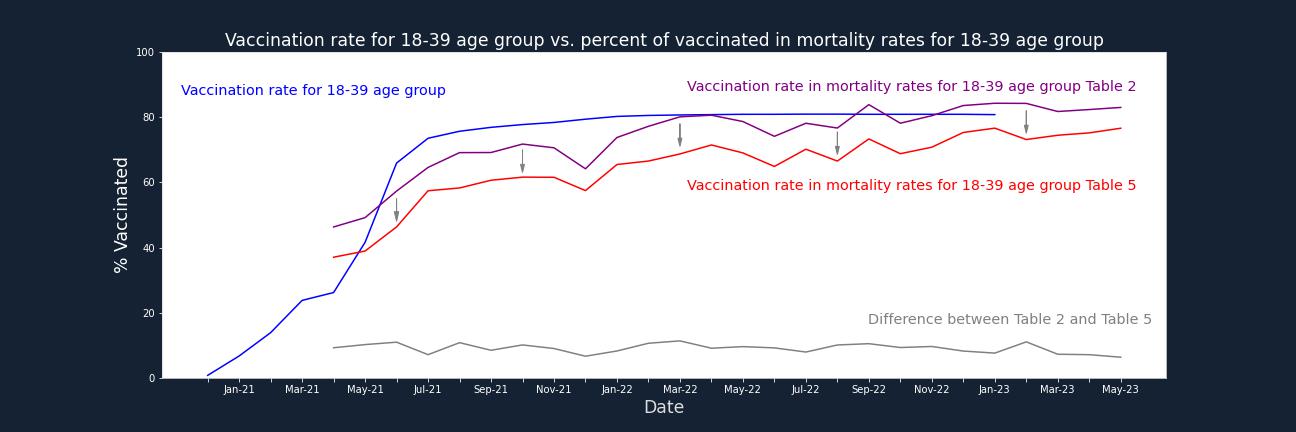
The charts below compare Table 2 and Table 5 vaccination rate in mortality rates to the vaccination rate in the population. Comparisons are broken down by age group.
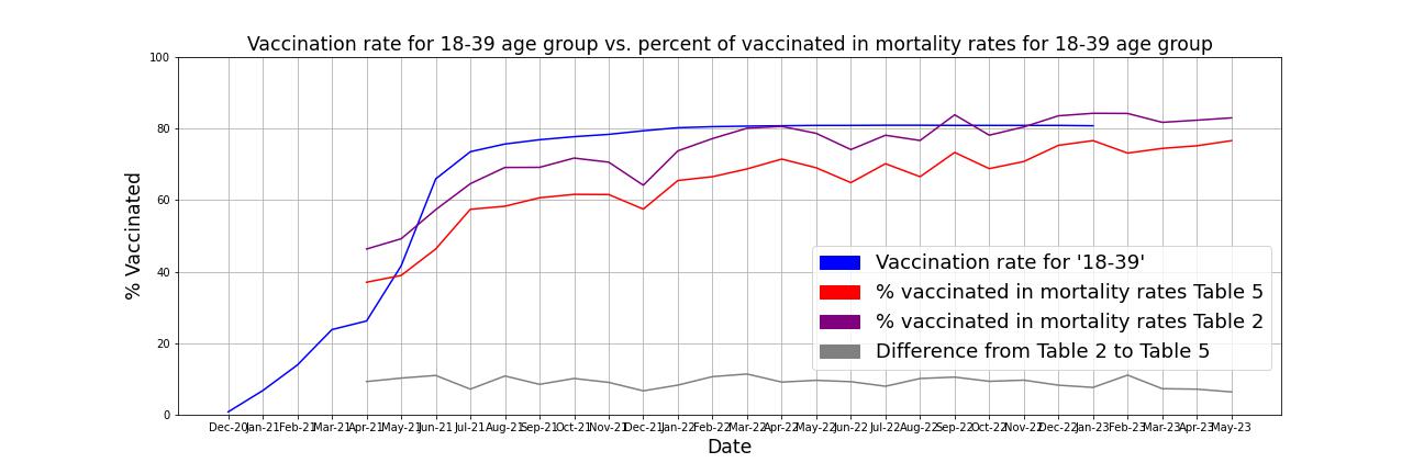
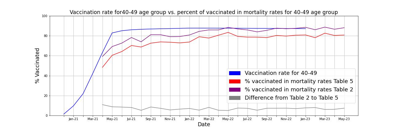
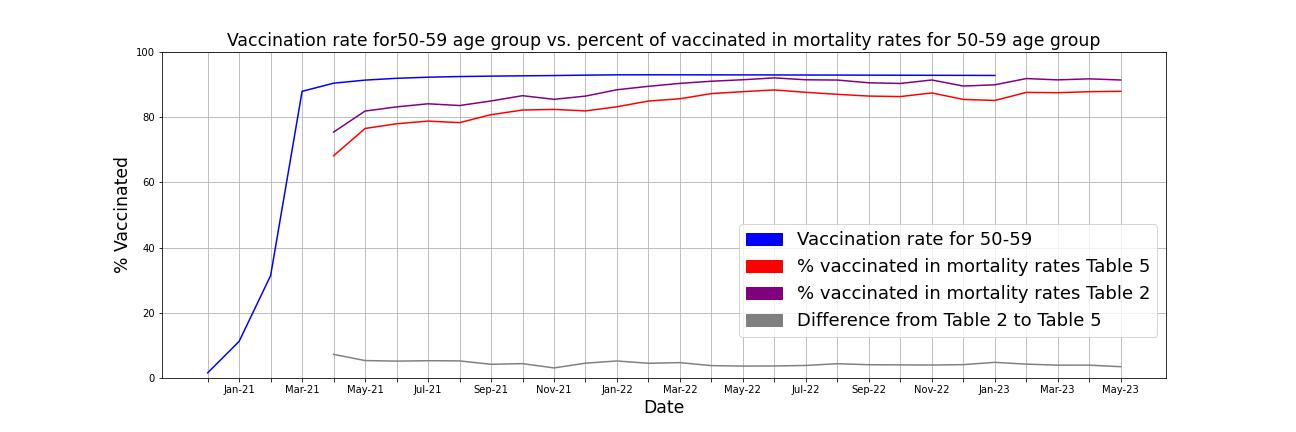
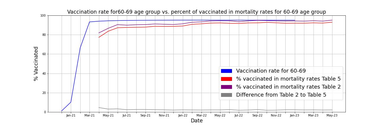
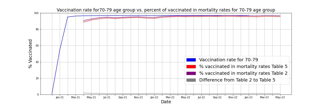
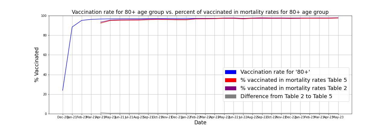
- Pattern, clear and consistent (across time and age groups):
- Table 5 vaccination rate is consistently lower (compared to Table 2 vaccination rate), across age groups and time.
- Table 5 vaccination rate is not just consistently lower, but also the rate at which it is lower is highly consistent. There is not much variability in difference between Table 2 and Table 5 vaccination rates within an age group. The table below shows the mean and standard deviation of the difference between Table 2 and Table 5 vaccination rates for each of the age groups (these differences are represented as gray lines in the charts above).
Differences in Vaccination rate (VR) across Table 2 and Table 5 Age group "18-39" "40-49" "50-59" "60-69" "70-79" "80+" Mean difference in VR .09 .07 .04 .02 .01 .005 Standard deviation of difference in VR .015 .014 .008 .005 .002 .001 For "18-39" age group the average difference between Table 2 and Table 5 vaccination rate is 9 %. And the differences between Table 2 and Table 5 vaccination rate remain fairly consistent.
- As age increases, the differences in vaccination rates between Table 2 and Table 5 shrink. For younger age groups, the differences in vaccination rates between Table 2 and Table 5 are higher compared to other age groups.
- Although Table 2 vaccination rate occasionally crosses the population vaccination rate, Table 5 vaccination rates never do.
- The vaccination rate lines for Table 2 and Table 5 are parallel. Even though there were significant differences between Table 2 and Subsequently added dataset, the lines for Table 2 and Table 5 are parallel (or because of them?).
The difference between mortality rates in Table 5 and Table 2 is 102.070 in total (across all age groups). That represents a 9.84 % increase of Table 2 data. So about 10 % was subsequently added to Table 2 (1.037.432) data to get to Table 5 data (1.139.502).
Yet, even though only 10 % was added to Table 2 data to get to Table 5 data, when comparing vaccination rate in mortality rates across the two datasets a consistent finding emerges: vaccination rates in Table 5 is lower for EACH data point (across age groups, time) compared to Table 2. Furthermore, the vaccination rate lines of Table 2 and Table 5 are actually parallel for each of the age groups (the differences remain pretty consistent). Another consistent pattern is that the differences between Table 2 and Table 5 shrink as age increases. This seems a lot more like systematic variance, than random variation.
Conclusions
If I hadn't known the source of data and trusted it, my conclusions would be:
There probably was an unclassified group in Table 2 data initially, and it was classified according to rules (into "Ever vaccinated" and "Unvaccinated" group subsequently). For example: The vaccination rate in mortality rates for each of the age groups should be on average lower by a pre-set percentage (this percentage is represented by the gray lines in charts above; and applying this rule would also result in a lot more variability in percentage increases (going from Table 2 to Table5) for the "Unvaccinated" group compared to the "Ever vaccinated" group). There is concerningly low variably in this category within an age group. There seems to be much more randomness elsewhere.
- But I trust the reliability and the validity of official records. It would be however interesting to know:
- Why are there differences from Table 2 to Table 5.
- How were cases classified, if they were previously unclassified based on vaccination status.
- How reliable was the classification of the subsequent data added to Table 5 in the "Ever vaccinated" and "Unvaccinated" groups, as the "Unvaccinated" group seems to be overrepresented in the subsequently added data compared to the Table 2 data (especially for the younger age groups).
Possible explanation for the differences
One possible explanation for the differences in Table 2 and Table 5 could be found within the table notes. Note 3 refers to linking to an NHS number, which could also be used to determine vaccination status. Note 3 applies to tables 1 through 4. We could assume that vaccination status could have been determined for individuals included in the 2021 Census linked dataset through links to NHS numbers. Because everyone was not included in the 2021 Census, some cases could remain unclassified based on vaccination status (in tables 1 through 4), and were not included in tables 1 through 4. Some of these cases were classified subsequently, as Note 14 (which only applies to Table 5) states that mortality rates refer to cases "where vaccination status could be determined, not solely those in the 2021 Census linked dataset". Screenshots of Note 3 and Note 14 are provided below.
This seems like a reasonable explanation, as about 10% of people were not included in the 2021 Census linked dataset and about 10% was added going from Table 2 to Table 5.
Note 3 and Note 14


Therefore, it seems that some cases could not be classified based on the 2021 Census linked dataset (Table 2 includes only mortality rates for cases that could be linked to the 2021 Census linked dataset). And ONS was able to subsequently establish vaccination status for some previously unclassified cases (Table 5). It seems reasonable to explore how effective ONS was in determining vaccination status of previously unclassified cases (for how many cases of all previously unclassified cases in Table 2 vaccinaion status could be determined subsequently and thus were subsequently included in Table 5). To obtain total mortality rates (which would include all cases, not including only mortality rates where vaccination status could be determined) I used the Monthly mortality analysis, England and Wales dataset. And compared mortality rates in Table 1 (Mortality rates in England) from the Monthly mortality analysis, England and Wales dataset to Table 5 and Table 2 mortality rates.
From April 2021 to May 2023, mortality rate is 1.166.923 in total in Monthly mortality analysis, England and Wales dataset. Therefore, in total 129.491 (1.166.923 - 1.037.432) of cases were not present in Table 2 data (as their vaccination status could not be determined). Subsequently additional 102.070 of cases were classified based on vaccination status and were included in Table 5. Only 27.421 cases remain unclassified based on vaccination status and are therefore not present in Table 5 (1.166.923 - 1.139.502). ONS was able to subsequently classify about 80% (79.92%) of previously unclassified cases (based on vaccination status).
I was interested in finding out whether there was a consistent pattern in how many cases remain unclassified for each data point (month). For this reason, I compared mortality rates in Table 5 (summing together the mortality rates of the "Unvaccinated" and "Ever Vaccinated" groups) to mortality rates in Monthly mortality analysis, England and Wales dataset. These comparisons are broken down by year (2021, 2022, 2023).
Comparing data for 2023
For 2023, 28.525 of cases still remain unclassified (in total the difference in mortality rates between Table 5 data and Monthly mortality analysis, England and Wales dataset is 28.525). This seems strange, as 27.421 was computed as the total difference in mortality rates between Table 5 and Monthly mortality analysis, England and Wales dataset. This could happen only if for other years (2021, 2022, or both) mortality rates in Table 5 exceeded those provided in Monthly mortality analysis, England and Wales dataset.
| Date | Mortality rates | Table 5 | Difference | Month | |
|---|---|---|---|---|---|
| 0 | May 2023 | 44608 | 38054 | 6554 | 2023-05-01 |
| 1 | April 2023 | 41966 | 40324 | 1642 | 2023-04-01 |
| 2 | March 2023 | 50920 | 45510 | 5410 | 2023-03-01 |
| 3 | February 2023 | 46389 | 41362 | 5027 | 2023-02-01 |
| 4 | January 2023 | 63177 | 53285 | 9892 | 2023-01-01 |
Comparing data for 2022
For 2022, only 1993 cases remain unclassified in Table 5 (in total the difference in mortality rates between Table 5 data and Monthly mortality analysis, England and Wales dataset is 1993). However, a more interesting finding emerges: Notice that some of the values in the difference column are negative. Indicating that the mortality rate in Table 5 exceeded mortality rates in Monthly mortality analysis, England and Wales dataset for that month (difference column was computed by subtracting Table 5 mortality rates form Mortality rates column obtained from Monthly mortality analysis, England and Wales dataset).
| Date | Mortality rates | Table 5 | Difference | Month | |
|---|---|---|---|---|---|
| 5 | December 2022 | 49339 | 59484 | -10145 | 2022-12-01 |
| 6 | November 2022 | 47611 | 43988 | 3623 | 2022-11-01 |
| 7 | October 2022 | 45353 | 46188 | -835 | 2022-10-01 |
| 8 | September 2022 | 42614 | 40090 | 2524 | 2022-09-01 |
| 9 | August 2022 | 44381 | 41554 | 2827 | 2022-08-01 |
| 10 | July 2022 | 42034 | 43855 | -1821 | 2022-07-01 |
| 11 | June 2022 | 41440 | 40186 | 1254 | 2022-06-01 |
| 12 | May 2022 | 45525 | 41967 | 3558 | 2022-05-01 |
| 13 | April 2022 | 42952 | 44845 | -1893 | 2022-04-01 |
| 14 | March 2022 | 46208 | 45404 | 804 | 2022-03-01 |
| 15 | February 2022 | 43084 | 41596 | 1488 | 2022-02-01 |
| 16 | January 2022 | 49802 | 49193 | 609 | 2022-01-01 |
Comparing data for 2021
For 2021, 3097 more cases were present in Table 5 than in Monthly mortality analysis, England and Wales dataset, from April 2021 to December 2021 (in total the difference in mortality rates between Table 5 data and Monthly mortality analysis, England and Wales dataset is -3097).
Overall mortality rate for 2021 in Table 5 is higher (3091) than in Monthly mortality analysis, England and Wales dataset. Eventhough Monthly mortality analysis, England and Wales dataset should be more comprehensive (as it is not limited to only cases where vaccination status could be determined).
| Date | Mortality rates | Table 5 | Difference | Month | |
|---|---|---|---|---|---|
| 17 | December 2021 | 49426 | 50809 | -1383 | 2021-12-01 |
| 18 | November 2021 | 48176 | 46513 | 1663 | 2021-11-01 |
| 19 | October 2021 | 43432 | 46440 | -3008 | 2021-10-01 |
| 20 | September 2021 | 44468 | 42536 | 1932 | 2021-09-01 |
| 21 | August 2021 | 40453 | 41621 | -1168 | 2021-08-01 |
| 22 | July 2021 | 40585 | 41708 | -1123 | 2021-07-01 |
| 23 | June 2021 | 38682 | 36937 | 1745 | 2021-06-01 |
| 24 | May 2021 | 35402 | 38649 | -3247 | 2021-05-01 |
| 25 | April 2021 | 38896 | 37404 | 1492 | 2021-04-01 |
Summary
The chart below reflects the findings: cases were subsequently classified based on vaccination status (no further information regarding how this was done is provided). This resulted in a consistent decrease of vaccination rate in mortality rates. The rate of decrease in vaccination rate remains fairly constant (within an age group). The degree of decrease in vaccination rate seems to be related to age: as age increases, the differences in vaccination rate in mortality rates between Table 2 and Table 5 shrink. For this reason, it would be important to further break down the "18-39" age group into "18-29" and '30-39' age groups and determine if this pattern is further exacerbated for the "18-29" age group.
Thank you for reading.